

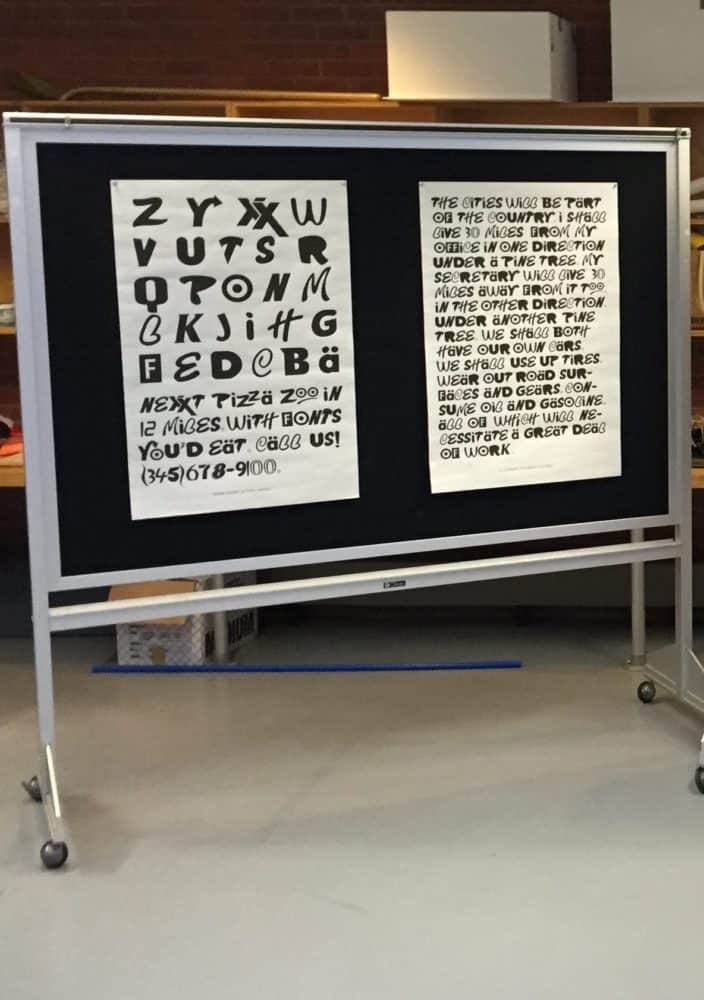
Sprawl Regular
Sprawl Regular reconfigures the familiar, colorful logos of the American typographic landscape. It was designed for Thine Alabaster Cities Dimmed by Human Tears, an anthology on American sprawl and its infinite sameness. While many of the letterforms are direct manipulations of existing specimen, others are hybrids inspired by the typographic strategies of corporate logo designers. The resulting typeface creates the sense of a disorienting familiarity.
Using:
Robofont, Scanner
:

